Quiet Luxury Interiors: Minimalist, Neutral & Timeless
Quiet Luxury Interiors: A Minimalist Approach to Timeless, Neutral Homes
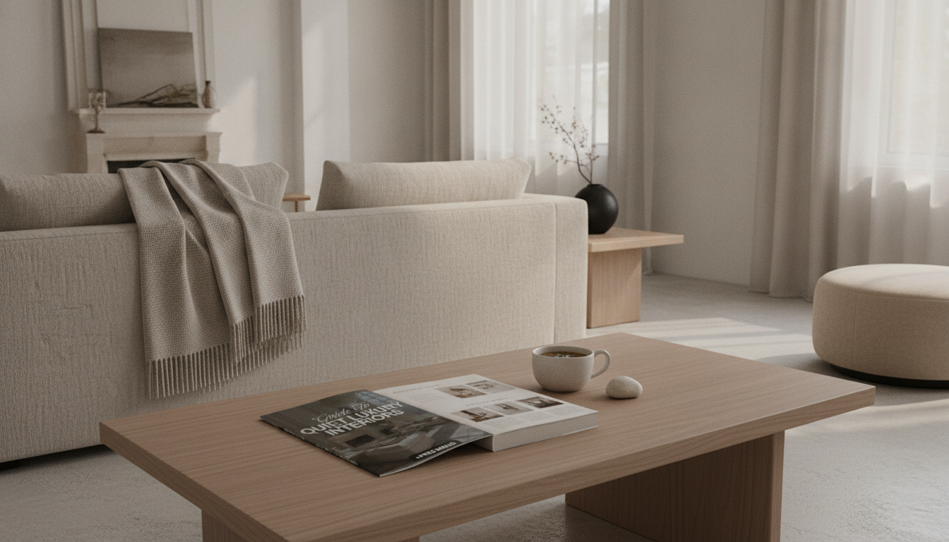
Quiet luxury interiors blend restraint, craftsmanship, and comfort—favoring fewer, better pieces, calm neutrals, and enduring silhouettes over fast trends. The goal is a home that feels intentionally edited, tactile, and lived-in, with design choices that age well and support daily routines. For more guidance, see Environmental + Interior Design – Chaminade University of Honolulu.
What “Quiet Luxury” Looks Like in a Minimalist Home
Quiet luxury doesn’t rely on loud statements. It reads as calm confidence—where proportion, material integrity, and thoughtful spacing do most of the work. For further reading, see [PDF] Robert Stilin Interiors – mcsprogram.org.
- Prioritizes quality, proportion, and material integrity over visible logos or flashy statements
- Uses negative space as a design tool: breathing room around furniture, art, and lighting
- Builds richness through texture (linen, wool, wood grain, stone) rather than bold patterns
- Keeps visual noise low: concealed storage, minimal countertop items, tidy cable management
- Balances warmth and clarity: minimalist, but not sterile
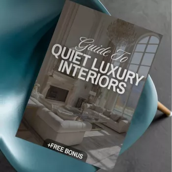
If you want a structured, room-by-room framework (including an editing checklist), consider the Guide to Quiet Luxury Interiors | Minimalist Home Design eBook | Neutral Palette, Timeless Style & Interior Design Checklist.
The Foundations: Layout, Scale, and Visual Calm
Before swapping pillows or buying a new accent chair, build the “quiet” part first: clear circulation, stable focal points, and storage that keeps everyday life from spilling into view.
- Start with circulation: ensure clear walking paths and functional zones before buying decor
- Choose fewer, larger anchors (sofa, rug, dining table) to avoid a “many small items” look
- Use symmetry selectively for calm (paired sconces, matching nightstands), but add one organic element for softness
- Hide everyday clutter with closed storage: credenzas, built-ins, baskets with lids
- Edit the room to one primary focal point (fireplace, view, art wall, statement light) and keep secondary elements quiet
A simple litmus test: if the room has ten “small moments,” it won’t feel serene. Trade several small decor items for one substantial, well-made piece that earns its footprint.
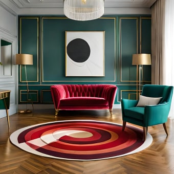
Neutral Palette Done Right: Depth Without Boredom
Neutral doesn’t mean flat. The most elevated neutral homes feel dimensional because values shift subtly and finishes change as you move through the space.
- Pick a base neutral family: warm (cream, sand, taupe) or cool (soft gray, stone, greige) and stay consistent
- Create depth using 3–5 tones of the same neutral, from light walls to mid-tone upholstery to deeper accents
- Layer finishes, not colors: matte walls, satin cabinetry, honed stone, brushed metals
- Use black sparingly for structure (frames, lighting, hardware) and avoid over-contrasting
- Add one restrained accent color only if needed (olive, muted navy, clay) and repeat it 2–3 times
Neutral layering guide (simple starting ratios)
| Layer | Suggested share | Examples |
|---|---|---|
| Base | 60–70% | Walls, large rug, main upholstery |
| Mid-tones | 20–30% | Secondary upholstery, drapery, wood tones |
| Deep accents | 5–10% | Hardware, frames, lamps, side tables |
| Natural texture | As needed | Linen, wool, leather, rattan, stone, ceramics |
When choosing undertones, it helps to understand how color families work across lighting conditions. For deeper color education, Pantone’s Color Education is a useful reference point.
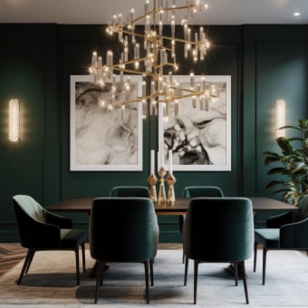
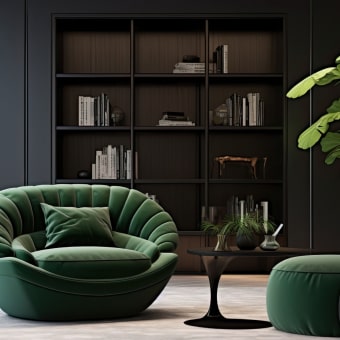
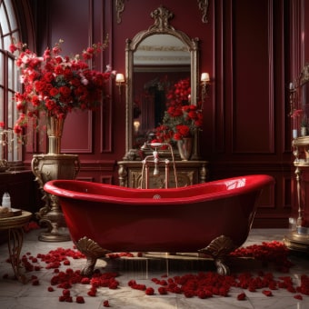
Materials and Textures That Signal Timeless Style
Quiet luxury reads through touch: a thick linen curtain, a honed stone surface, a wood grain that looks better with age. These are the cues that feel “expensive” without trying.
- Wood: oak, walnut, ash—prefer visible grain and classic profiles over high-gloss trends
- Stone: honed marble look, limestone, travertine, or quality quartz with subtle veining
- Textiles: linen, bouclé, wool, cotton—use texture to replace pattern-heavy styling
- Metals: brushed nickel, aged brass, blackened steel—keep the finish consistent within a room
- Avoid “costume” finishes: overly shiny chrome everywhere, faux distressing, or loud geometric surfaces
- Aim for repeatable touchpoints: at least three natural materials per room (e.g., wood + linen + stone)
For ongoing inspiration on enduring silhouettes and well-made spaces, Architectural Digest’s interior design coverage is a strong benchmark for classic proportion and material choices.
Room-by-Room: Quiet Luxury Choices That Matter Most
If you’re coordinating subtle accents (like muted blues, soft grays, and airy neutrals) across textiles and decor, the Summer Color Harmony Bundle | summer season colors 3-in-1 Digital Guides can help keep undertones consistent so the whole home feels unified.
Lighting: The Fastest Way to Make Neutrals Feel Expensive
For practical lighting fundamentals and research-backed guidance, explore the Lighting Research Center (LRC) resources.
The Interior Design Checklist: A Practical Editing System
Common Missteps That Break the Quiet Luxury Effect
A Simple Upgrade Path (From Quick Wins to Investment Pieces)
Digital Guide for a Cohesive Neutral, Timeless Home
To streamline decisions from layout to finishing touches, the Guide to Quiet Luxury Interiors | Minimalist Home Design eBook | Neutral Palette, Timeless Style & Interior Design Checklist is designed to be revisited as you refine your home over time.
FAQ
How is quiet luxury different from minimalist design?
Minimalism is primarily about reducing and simplifying, while quiet luxury adds premium materials, craftsmanship, and tactile warmth. It stays restrained, but feels richer through texture, better proportions, and enduring details.
How can a neutral palette feel warm instead of bland?
Choose a consistent warm or cool neutral family, then layer multiple tones and natural textures like linen, wool, and wood. Warm lighting (around 2700K–3000K) and dimmers also help neutrals feel inviting rather than flat.
What should be the first purchase to elevate a room quickly?
A quality lamp with warm bulbs is one of the fastest upgrades, especially in neutral spaces. A properly sized rug is another high-impact foundation—paired with decluttering and a clear layout so the room reads calm and intentional.


Leave a comment